Typography
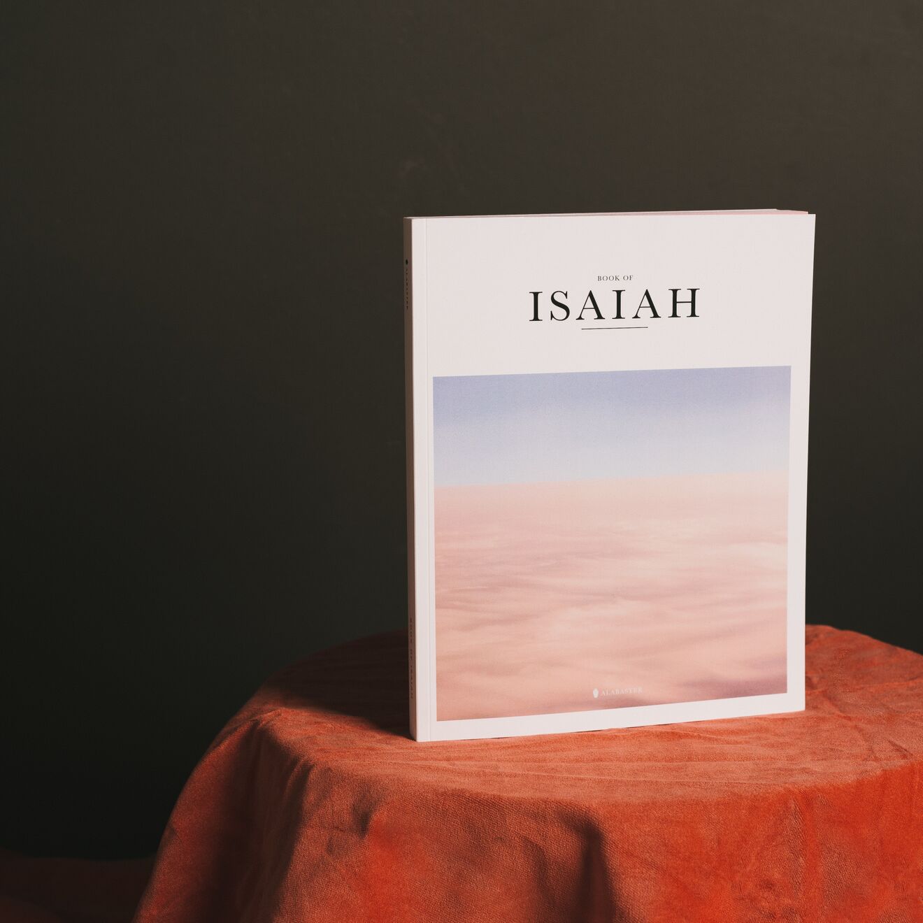
A classic serif was picked for its quiet, literary confidence. Letter spacing was widened slightly on the title to slow down the eye — a small typographic gesture that mirrors the unhurried tone of the essays inside.
Print details
The final cover was produced on an uncoated matte stock to keep the photograph from feeling glossy or commercial, preserving the soft, almost painterly quality of the original image even in print.
Outcome
The book has since been reprinted twice, and several booksellers noted the cover specifically as a reason customers picked it up off the shelf — a good reminder that restraint can be its own kind of impact.